Sunday, March 1, 2020

Lab Six: Processing Image data in Pix4D - with GCPs

Introduction

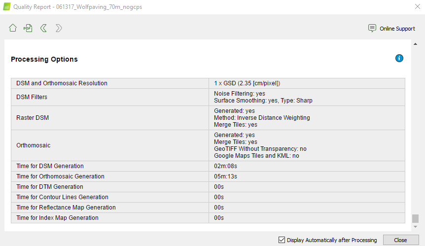
In this week’s lab, we moved back into exploring with the Wolfpaving data set but this time we added in GCPs, (Ground Control Points). GCPs are designated as spots on the surface of the earth that are observed positions used to geo-reference imagery. Our class needed to go back into the Wolfpaving Data and reprocess it to show the difference between the maps with GCPs and the one from last week (non-GCPs). When it comes to quality, using GCPs can help improve your data if your drone is not RTK equipped. RTK (Real-time kinematic positioning) is a satellite navigation system used to improve the precision of point data obtained from satellite-based positioning systems. This can be anything from the U.S (GPS), GLONASS, Galileo, etc. So, without RTK, Skipping ground control points may generate not a precise finished project, and the regeneration of the data might not have an exact measure and orientation. Many people get confused when discussing GCPs and think that they are in relation to checkpoints produced in Pix4D. When it comes to checkpoints, they are used to estimate the complete exactness of a given model, in this case, the Wolfpaving data. The marks of the checkpoints are used to determine the 3D position as well as any errors when clicking on GCPs. To see how off the first indicated positions were from the GCP’s locations, you are able to see the results in the quality report: figure 1


Figure 1 (Initial Quality Report)

Methods


Working with the Wolfpaving Data again this week made it easy to find everything and be able to reprocess it with GCPs. I was able to get the GCP coordinates via a text file, provided in the Class 319 folder. The coordinates were presented in a YXZ format for proper accuracy & location (figure 2). We were able to import the data into Pix4D under the project tab. Making sure that Pix4D knows that you data is in YXZ format is important otherwise your point locations may leave thinking that you did something wrong. I initially didn't take note of this a saw that my point locations were in South Africa and not in the United States midwest. So, I had to manually enter the format and regenerate the location of the points to get the correct positions.


Figure 2 (GCP Coordinates)
We then experimented with the rayCloud editor to make sure that our GCPs locations matched up with the initial processes data. We had to manually find the painted "L" shaped GCPs through Pix4D and line up the positions to make sure that they matched precisely. As seen in figure 3, the GCPs used for the Wolfpaving Data were painted orange and we needed at least two matches so that Pix4D can understand the true GCP location.


Figure 3: GCP and Clicked Location using rayCloud
After this step, we needed to rematch and optimize the data. Looking back at figure 1, this helped us realign the green dost with blue dots to make them perfectly overlap for well-defined data. The whole process took a total time of about 45 minutes which if we had more GCPs/ data this can take up to hours and even days depending on the size of the data you are trying to process.

Discussion/ Comparison


Figure 4: Ortho Comparison 


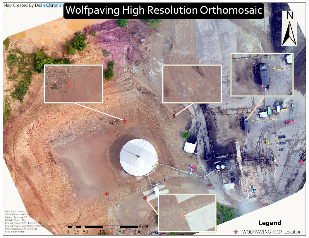
Looking at this week’s lab, you can see in the Orthomosaic with GCPs, the GCPs align with the painted GCPs. This makes the overlap of the projection to the ground a whole lot more accurate and items in the map are more easily defined as seen in  (figure 4). Once the data was processed in Pix4D, I moved the data over to ArcGISPro and developed a map with insets to show GCP locations (figure 5). I made the GCP locations a ‘red cross’ to make it easily visible to distinguish their locations. I even zoomed in on the Wolfpaving data to where there is a work trailer to show the detail of the given map processed. Overall this was a fun lab and experiencing the use of GCPs helped me understand the concept of precision when it comes to work-related jobs in this field.


Figure 5: (Final Product GCP Orthomosaic)

Conclusion


The use of GCPs makes me recognize the accuracy of the data that we are able to process. I also learned about the significance of proper field notes when it comes to data collection. When we enter this industry, we want to make sure that we prepare the best and most accurate results for our client. This shows them our skill set as well as the capability of solving/ viewing a certain problem.

Sunday, February 23, 2020

Lab 5: Getting Started with Living Atlas

Introduction:

In this week's lab, we were able to explore the function of the Living Atlas in the application, ArcGIS Pro. What the living atlas comprises of is a wealth of data spanning from calculated painful to population growth and much more. Using this pre-determined data, we can build upon it and show correlations between different data sets. At the beginning of this lab, we were able to follow an online tutorial that helped in becoming familiarized with all the components/ functions of the living atlas. While exploring through the website, I have found five lessons that I found to be interesting as it can relate to the UAS industry. 

Informational Methods 

Get Started with ArcGIS Living Atlas of the World

The mandatory lab assignment for this week's lab was to go through and follow the "Get Started with ArcGIS Living Atlas of the World," tutorial. Throughout this tutorial, we were able to familiarize ourselves with multiple functions spanning from the categories pane to water balance apps coming from the contribute tab. One of the most significant things we learned here was adding different atlas layers to one map. We started by viewing the population growth of Las Vegas, showing the intensities of the red darken as the population increased over the years (figure 1).

Figure 1: Population Growth of Las Vegas 05'-06'

The next thing did move across the Baltimore, MD, and experimented with population imagery. We were able to create and scale using colors ranging from light blue (small population) to dark purple (high civilization). The map now helps us distinguish urban areas based on various colors dealing with population density, making it easier to variations at different locations (figure 2).


Figure 2: Population Density Baltimore, MD
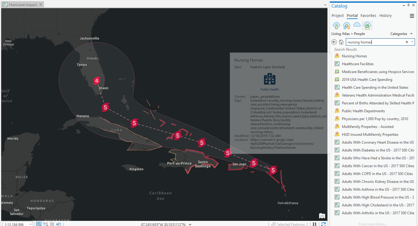
The last part of this tutorial was finding a specific Atlas layer and using its data to picture out the destruction of Hurrican Irma, off the coast of Florida. We were also able to determine it's projected path using the data from the National Hurricane Center. We were also able to incorporate the location and number of Nursing homes in the area and see where the hurricane path will move through those areas. This could be helpful information to present beforehand since the National Hurricane Center was able to predict the intended route and that there is data available for the number of nursing homes in the area. This could be sent out as a warning and help people evacuate and get to safety. The overall goal now for I was to play around with layers in the Atlas. And finally,  piece multiple layers together to show a picture/ correlation of all. 
Figure 3 (Projected Hurricane Path ArcGIS Atlas Tutorial with MetaData)


Figure 4 ((Projected Hurricane Path With Nursing Home Locations ArcGIS Atlas Tutorial)

Helpful Tutorials that I found to be Beneficial to the UAS Industry & to Myself 

Georeference Imagery in ArcGIS Pro

When it comes to rater data, usually the most common way, drone aerial imagery, the data tends to be pretty accurate. But, there may need adjustments using the process learned in class, photogrammetry. This tutorial helps with lining up multiple GIS data. When we arrange imagery using georeferencing tools such as GCPs (Ground Control Points), you can distinguish image location using coordinate systems. This is beneficial to the UAS industry because we work hard to be as precise as possible. Whether it is showing a client or proving a point, having critical data to stand behind is helpful.

Mapping the Battlefield

This one I found to be fascinating as it shows how military conduct clearing operations by viewing various 3D maps of missions. This map tutorial deals with possible visibility issues, obstructions, floor levels, and how personal should move from point A to B. 

ArcGIS Pro Shortcuts

Another remarkably valuable source was the shortcut tutorial. This link should me various shortcuts while using the ArcGIS application and definitely lowered my time while working on a project and trying to figure out how to do certain matters. Most of us are fast typers and being able to find shortcuts using the keyboard will make processing data and creating maps more efficiently.

Estimate Solar Power Potential

Lastly, solar power has been a hot topic over the last decade and is helpful to our environment. The goal of this source was to map out potential Solar Power use over an area in Wsiggonton D.C to reduce electrical output and electrical costs. Using a pilot launched UAS program, a non-profit organization was able to map out how was able to install solar panels, and show the effect of its installation over the town. I found this astounding as we continue to go green and protect our environment. 

Creating My Own 

As I took on the challenge of creating my own layered map, I decided to look close to home. In my findings, I was able to show a correlation between high traffic roads and the number of accidents, fire stations, and hospitals in a given area. I first pulled in a data set that showed traffic congestion in North American and focused on Queens, New York. As seen from the Metadata, green represented low traffic, yellow-medium, and red for extraordinary traffic  (figure 5).


Figure 5 (Project MetaData)
I added in five different layers:

  • Urban Area, Long Island, New York: to show the contrast
  • Traffic Flow (Figure 6) North America: various (High to low on major highways/ roads)
  • Firestation Locations 
  • Hospital Locations
  • Accident Locations


As seen from my maps, you can see areas where there is high traffic flow, more accidents occurred. Not only that, you can see that there are generally more fire stations near high traffic/ populated areas as you move further West into Queens. Finally, if you are able to notice that more Hospitals are located near major roads that are highly populated. In conclusion, I was able to pull in different layered maps from the Atlas and create a generalized map showing correlations between traffic and the number of accidents, hospitals, and fire stations near a given location (figures 8,9,10).  

Figure 6 (North America Traffic Flow)
Figure 7 (Number of Accidents, Hospitals, & Fire Stations)
Figure 8 (Queens, New York:  Traffic-Related Accidents Correlation Map)
Figure 9 (Queens, New York: Traffic Flow Map)

Figure 10 (Correlation)

Conclusion:


This week's lab was very educational. It helped us familiarize the Living Atlas, view beneficial sources, learn shortcuts with the software and finally be able to mess around a create our own layered map. This was not much a step back, but being able to take a breather and learn new things/ recover topics that may have been confusing at first was nice to offer. I can now show correlations between different data sets that may be beneficial to individuals depending on the topic and industry presented.

Monday, February 10, 2020

Lab # 4 Processing Image data in Pix4D (without GCPs)

Introduction:
Figure 4 (Wolfpaving Orthomosiac)


§ What is Pix4D?


In this week’s lab, we experimented with the software program Pix4D. Pix4D is a program that takes up to thousands of images to generate one detailed 2D/3D image. It automatically converts images taken by drones, by hand, or by plane. And finally, it presents profoundly clear, georeferenced 2D maps and 3D models. Some products that it generates are cities, forests, farms, and much more. During the process of this week, we used our previously used Wolfpaving data to create a 3D animation of the area. Pix4D is an essential tool for UAS data processing because of presentation purposes. Having a 3D model accessible to show clients problems/ situations dealing with the terrain can be easily viewed and comprehended.  

Methods:


 Factors that should be considered when designing an image acquisition plan? 

  • Representation of terrain/object to be restored.
  • Ground Sampling Distance (GSD): This will determine flight height the equipment was flown at during a mission
  • Overlap: The overlap depends on the kind of terrain that is mapped and the speed at which the images are taken
o Image Acquisition 
When designing an image acquisition plan, one of the most prominent things to note is what type of terrain/ object you will be reconstructing. The image acquisition plan has a high impact on the quality of work that you will produce. Another factor to consider is using a grid image acquisition because it helps with increasing the overlap to have clearer results. Lastly, when designing an acquisition plan it is recommended that you fly higher during a mission because it improves your results when making a map. 

o Overlap
Figuring out how much overlap you should set during the creation of a project is important to know the quality of your project. Before you start the process of combining all the pictures together, you should open all the images up and take a look at what you captured. Scanning through the images can make you see which ones were good and which ones will fall nicely with one another. During this lab assignment, we had 21 images to work with and you can see that all 21 images were used and worked thoroughly together. By opening up these images we can visually check how well the overlap is and if it was imminent enough.  
Bare minimums for overlap front and side
The general bare minimum for overlap is as follows: 
  • 75% frontal and 60% side overlap in general cases.
  • 85% frontal and 70% side overlap for forests, dense vegetation, and fields.
    • There is an increased need for the dense forest because how the number of objects that are included in the picture. The more there is, the more overlap we will need to clearly define the vegetation. 
  • 85% frontal overlap for single-track corridor mapping. Use a 60% side overlap if the corridor is acquired using two flight lines.
o Photo stitching vs. Orthomosaic generation
Photo stitching is only used for small data sets because it only works best on terrain that is nearly flat. This is because the process of this uses a method of gluing images together just like a puzzle. A low data set can be used because it only requires a low amount of matches or key points during the overlap process. Using this method on uneven terrain can lead to distortions and the whole data set gone to waste. Orthomosaic is based on a method called, orthorectification. This method consists of removing distortions from images using a digital surface model. This can only be done if the overlap was performed well and there is a high number of matches from picture to picture.  
o Merging Projects
When comes to merging projects it can be useful for when working with different acquisition types in particular, terrestrial, grid and circular are practiced. It is also helpful for the process of reconstruction of an object using two different types of equipment to capture the image. (phone camera or a GoPro combined to make a 3D model.

o Difference between a Global and linear Rolling Shutter
Example Image of Global/ Rolling Shuter
The difference between the global shutter and linear rolling shutter is dependent on how the image
is captured. As seen above, the global shutter captures the entire image at once, creating uniformity
throughout. While rolling shutter using progressive motion during it’s exposure time. This why
rolling shutter causes wrapping in an image as seen above to the right. 
o GCPs necessary for Pix4D? When are they highly recommended?
Ground control points are points on a surface, anywhere on earth, that the point has a known location
and is used for geo-reference imagery. GCPs are not necessary for Pix4D but they are highly
recommended when using large data sets to make it easier to clearly define each point of interest
on the entirety of the image you are trying to create. In this week’s lab, we did not use GCPs because
this was an introductory lab for Pix4D and time permitting, we just needed to learn how to work
through the system and become proficient. Using GCPs will help define and link key points together
to produce a higher quality picture and will give a better quality report depending on the images that
were captured. 
o Quality Report
During the processing report, once data has been run, a quality report is pulled up on the screen.
There are three steps taken during the processing stage. There are initial, point cloud/ mesh and
DSM/Orthomosaic for step three. Step one processing must be completed first and when it is finished,
we are given a quality report on the data that was processed. Some of the things (but not all) that are
included in a quality report are, a quality check, Preview, Calibration Details, Initial Image Positions,
Computed Image/GCP/Manual Tie Points Positions, Absolute Camera Position and Orientation
Uncertainties, Overlap, coordinate systems and much more (as seen in figure 1 & 2). It also tells you
how many of the pictures were able to be processed out of the images you used in the data set.
As I said above, we used 21 images and 21 images were all processed and used (none rejected).
Viewing the overlap from our Wolfpaving data set we can see at the edges of the map were where
there was poor overlap, depicted in yellow. This could be because it wasn’t the main area of focus. 
Figure 3 (Animation)
Figure 1 (Quality Report)


Figure 2 (Quality Report)


Talking about voids again as we were processing, near the edges of the area that was photographed
were some gaps due to not enough overlay as the drone was capturing pictures. This was because
the edges weren’t the area of interest and more pictures were taken by the mounds to look for erosion
and possibles hazard areas. (Take a look at the animation.)
Differences between the DSM with no GCPs and last weeks lab with GCPs
Now moving back to using ArcGIS Pro we were able to use the data that was given a create a hillside
DSM. We can see that there is a difference in values between this generated DSM (figure 5) and the
one from last week’s lab (figure 6). This is because one was processed with GCPs and the other one
was not. When using GCPs we can get more accurate results because each point gets specific
coordinates including elevation to precisely show slopes and changes in terrain. By placing GCPs at
different elevations we can see the differences between each point and have a greater range between
slopes. This is why in (figure 6) there is a greater range between elevations than the one we produced
this week (figure 5).  
Figure 5 (Hillsahde DSM without GCPs)
Figure 6 (DSM with Slope & GCPs)
Conclusion:

Pix4D is a great tool to use when developing projects for commercial use. Bringing together UAS data and incorporating it into a 3D model can be an eye-opener. In this week’s lab, we were able to understand the components/ tools that are used in Pix4D and got develop a 3D animation of the area. We then transferred to ArcGIS Pro and developed a DSM to compare the DSM created from last week’s lab to see that difference in values based on using GCPs and not using them. Without using GCPs the processing time takes a lot less and gives a smoother look to your model. This is because there are no GCPs at different elevations to show precise differences. The more data you have, the longer the processing time it will take. So, you have to be patient and make sure that you do everything right the first time.

Saturday, February 8, 2020

Lab #3: Building Maps With UAS Data

Part 1 (Introduction):

During this week’s lab, we were able to develop upon the skills that we’ve learned last week and were able to produce our own maps using UAS data. Using UAS taken data from an area in Wisconsin, we were able to create a slope map and an aspect map which are tools located in the raster function. Also included in one of my maps was an orthomosaic of the terrain to show the action features that were being presented in the slope map. As we moved through this lab in sections our assignment was to answer a series of questions dealing with the concepts that we studied in on. 
(Figure 1) ArcGIS Wolfpaving Slope
(Figure 2) ArcGIS Pro Wolfpaving Aspect View
Figure 8 (Wolfpaving DSM Hillshade)
· Why are proper cartographic skills essential in working with UAS data?
Cartographic skills are essential when working with UAS data because it deals with how we are able to present our work. Being capable of communicating with someone using words is not always easy. You need to figure out your audience and make it possible to present your findings visually. Many people in this industry are visual learners and seeing the different color schemes makes it easier for people to understand what you are showing them. As seen on my map above, having the different colors represent different terrains helps my audience realize the different types of slopes in this area. 
· What are the fundamentals of turning either a drawing or an aerial image into a map?
The reason for turning drawings or an aerial image into a map is to further give it context. A picture may just be a picture but, adding data sources into a picture can give it so much more. The picture may show erosion, it may show the various inclines and declines, other important elements that may be an issue. It gives us data that we as people may not be able to see from the naked eye. 
· What can spatial patterns of data tell the reader about UAS data? Provide several examples.
Spatial patterns can tell someone a lot of information. UAS data is not always just taking a drone up in the sky and taking a video of something cool. For example, if we wanted to do a study on air traffic in the state of Indiana, we can depict a map to show areas of high traffic flow using colored patterns on a map. Whereas, red can indicate high areas of traffic and white or no color can depict areas of light to no traffic at all. This can help aviators see where there is the most traffic and maybe avoid these areas when practicing to fly. 
· What are the objectives of the lab?
The objective of this lab was to show that a map can tell the viewer so much about one area of interest. In the lab, we were able to depict different aspects of this terrain to show, slope, ortho imagery, and 3D-terrain. This gave us and the audience altered perceptions on what may be some issues dealing with this area and help aid a solution on how to deal with the problem. Another objective of this lab was how to create a detailed map and what should be included. During this lab, we’ve learned that presenting a well complete map, you must include a North Arrow, Scale Bar, Locator Map, Watermark and metadata. Metadata includes the pilot, altitude, UAS platform and sensors that were being used in the time of operation.

PART 2 (Methods):


During the start of this lab, we copied over the data and moved it into a temp folder for when we were working on the project in ArcGIS Pro. Putting the data in the temp folder allowed us to work on our projects without it running sluggish. The temp followed has more space and the process runs faster. So while we worked throughout the week we left all data in the temp folder and had our backup copy in our own personal (AT 319 folder). Once we’ve completed the map and the lab we then were able to move everything into our personal class folder where it can be saved and viewed at any time. For organization, the project folder should include three sub-folders to depict data, ArcGIS work, and our finished product. These folders can be broken down into three categories; data collection, processed work, and final examination to make it easier to find and go through project material.   
Example of File Collection
o What key characteristics should go into folder and file naming conventions
When it comes to what should be included in all these folders is how we work through a project. In the beginning, we compile a large amount of data. Data that may be photos, videos, and other basic first-hand data. All this data should be placed in one folder to make it easy to move it around into applications such as ArcGIS Pro. The processed work folder will be designated for, (work in progress) as we compile and manipulate the data in certain applications. The third and final folder will be present to depict finished work and used for examination and evaluation. In this lab’s case, I would put my slope map and orthomosaic map in this folder for viewers to see. We would also want a separate section in here to show the metadata either as another folder or separate document in the third folder. This shows the basics of how we got this data and how we achieved to get this data.  


Why is file management so key in working with UAS data? How does this relate to the metadata?
When dealing with a lot of data, file management is crucial when working through an assignment. There is so much data when working with UAS data and not knowing where certain things are, can slow down the process and make it complicated to finish an assignment on time. Having separate sections can help distinguish where the raw data, work processing and where your final product is for accessible viewing. Keeping all neat and complied can help view the metadata and understand the background behind the data you are working on.
o What key forms of metadata should be associated with every UAS mission
Key forms of metadata should include the date, time, location, altitude, UAS platform, coordinate systems, and the pilots involved.  

Throughout the lab, we were able to add a DSM and an orthomosaic on top of our base map to create contrasts. We were given this data to work from the WolfCreek mining location and it was in forms of raster/vector data that we could form an add-in to the application. The digital surface model was stored straight into ArcGIS Pro so we would be able to develop a 3D model, show variations of the slope, and aspect to show movement/control. 
o What basemap did you use? Why?
A global street map was used as the base layer. This was because a street map shows major roads in the area and other features such as bodies of water, (lakes, ponds, rivers, etc.)
o What is the purpose of these commands: (Pyramids and Calculate Statistic)
Using the pyramids command helps with making Digital Surface Models more accessible to view and manage in ArcGIS Pro. The calculate statistic command helped using find the calculations and variations of the slope. We see the variations in color but actually have numbers associated with the colors that can help show how much of a difference the terrain varies in slope. 
o Why might knowing Cell Size, Units, Projection, Highest Elevation, Lowest Elevation be important?
When it comes to knowing cell size, units, and other important values, we won’t be able to know the full extent of what is being present. Looking at the map with slope variations is helpful but how large is slope difference? This can lead to data being distorted. 
o What is the difference between a DSM and DEM?
DSM (digital surface model) shows the natural elevations of territory covered over a specific area of interest including buildings, trees, plants, and other vegetation. While a DEM (digital elevation model) is a DSM excluding the features I’ve previously said. DEM’s appear to be smoother but miss vital information for helping with landscape modeling/ city modeling. 
o What does hillshading do towards being able to visualize relief and topography?
Hillshading helps view differences in levels of terrain. When hillshading is applied, it shows areas of high angles off of the level slope region. When there is a high difference we can see that the color over the terrain is darker. Vice versa for areas of gradual change being area of light coloring. When the map is a finished product and has a legend we can see what the variations are in comparison to a numeric height. 
o How does the orthomosaic relate to what you see in the shaded relief of the DSM
Having an orthomosaic model located on another map for comparison, helps the viewers understand where the area is in perceptive to seeing it in the real world. So when viewing the different slope depths on the hillshading map, we can point out where the high levels of the slope are changing dramatically and move back towards the orthomosaic to locate where we can see this happening in person. 
(Figure 3) ArcGIS Pro Ortho View


o What benefits do hillshade and 3D view provide? How might this relate to presenting this information to a client/customer?
Presenting to a client/ customer from a piece of paper that only includes words will make it very hard to convey the significance behind what you are trying to characterize. Having a hillshade and 3d view of a model showing the fluctuations of depth and can help the customer/client conceive the problem and come up with a solution. 
o What color ramp did you use? Why?
The color ramp that I used for this lab was a bronze-yellow and moved up to a color called crimson red. We used this color ramp for this lab because it had good contrast in showing the differences in elevation while not getting confused with other types of imagery using a similar scale. 
o How might generated slope and aspect configurations of combined data analysis prove useful to various applied situations?
One of the biggest things that slope and aspect configurations are useful for is viewing areas of erosion. Knowing where areas of erosion are can help with figuring out a solution to stop terrain movement. 


Part 3 (Conclusion):
·Summarize what makes UAS data useful as a tool to the cartographer and GIS user
UAS data is useful to a cartographer and a GIS user because of what you are able to do with the data. Depending on the data that is obtained we can view an array of data spanning from, thermal imagery, slope analysis, aspect analysis, ortho imagery, and much more. This data is such a useful tool for GIS users so that they can manipulate the data and create a map or depiction showing what they were able to discover. Like in this lab, we were able to discover the variations in slope at a mining facility and point out areas of high elevation where erosion may occur/ is happening. This can help clients visualize how bad a problem may be and force a plan of action to fix it. 
· What limitations does the data have? What should the user know about the data when working with it.
One of the biggest limitations with data that we have is the equipment that was used. Depending on what equipment we used such as the type of drone, type of sensors, scope range of the drone we need to make sure we know what the client wants. It is always important to know what the customer/client wants so that we can know what equipment is necessary for the job and be able to collect the right data. Another limitation is the user himself/herself. You need to make sure that the person working on the data is knowledgeable in using the application to manipulate the data. Otherwise, problems may arise when applying different layers of interpretation. 
· Speculate what other forms of data this data could be combined with to make it even more useful.
Other data that could have been combined with this data could be erosion patterns. Knowing where the erosion is occurring can set in a plan of action to correct it from getting worse. Also, viewing from above can help with depicting areas of high risk for terrain movement and let workers know where not to stand for long periods of time.