Introduction:
In this week's lab, we were able to explore the function of the Living Atlas in the application, ArcGIS Pro. What the living atlas comprises of is a wealth of data spanning from calculated painful to population growth and much more. Using this pre-determined data, we can build upon it and show correlations between different data sets. At the beginning of this lab, we were able to follow an online tutorial that helped in becoming familiarized with all the components/ functions of the living atlas. While exploring through the website, I have found five lessons that I found to be interesting as it can relate to the UAS industry.
Informational Methods
Get Started with ArcGIS Living Atlas of the World
The mandatory lab assignment for this week's lab was to go through and follow the "Get Started with ArcGIS Living Atlas of the World," tutorial. Throughout this tutorial, we were able to familiarize ourselves with multiple functions spanning from the categories pane to water balance apps coming from the contribute tab. One of the most significant things we learned here was adding different atlas layers to one map. We started by viewing the population growth of Las Vegas, showing the intensities of the red darken as the population increased over the years (figure 1).
 |
| Figure 1: Population Growth of Las Vegas 05'-06' |
The next thing did move across the Baltimore, MD, and experimented with population imagery. We were able to create and scale using colors ranging from light blue (small population) to dark purple (high civilization). The map now helps us distinguish urban areas based on various colors dealing with population density, making it easier to variations at different locations (figure 2).
The last part of this tutorial was finding a specific Atlas layer and using its data to picture out the destruction of Hurrican Irma, off the coast of Florida. We were also able to determine it's projected path using the data from the National Hurricane Center. We were also able to incorporate the location and number of Nursing homes in the area and see where the hurricane path will move through those areas. This could be helpful information to present beforehand since the National Hurricane Center was able to predict the intended route and that there is data available for the number of nursing homes in the area. This could be sent out as a warning and help people evacuate and get to safety. The overall goal now for I was to play around with layers in the Atlas. And finally, piece multiple layers together to show a picture/ correlation of all.
 |
| Figure 2: Population Density Baltimore, MD |
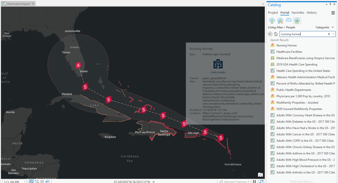 |
| Figure 3 (Projected Hurricane Path ArcGIS Atlas Tutorial with MetaData) |
 |
| Figure 4 ((Projected Hurricane Path With Nursing Home Locations ArcGIS Atlas Tutorial) |
Helpful Tutorials that I found to be Beneficial to the UAS Industry & to Myself
Georeference Imagery in ArcGIS Pro
When it comes to rater data, usually the most common way, drone aerial imagery, the data tends to be pretty accurate. But, there may need adjustments using the process learned in class, photogrammetry. This tutorial helps with lining up multiple GIS data. When we arrange imagery using georeferencing tools such as GCPs (Ground Control Points), you can distinguish image location using coordinate systems. This is beneficial to the UAS industry because we work hard to be as precise as possible. Whether it is showing a client or proving a point, having critical data to stand behind is helpful.
Mapping the Battlefield
This one I found to be fascinating as it shows how military conduct clearing operations by viewing various 3D maps of missions. This map tutorial deals with possible visibility issues, obstructions, floor levels, and how personal should move from point A to B.
ArcGIS Pro Shortcuts
https://www.esri.com/content/dam/esrisites/en-us/media/pdf/g526942-arcgis-pro-kybrd-shrtct-FINAL.pdf
Another remarkably valuable source was the shortcut tutorial. This link should me various shortcuts while using the ArcGIS application and definitely lowered my time while working on a project and trying to figure out how to do certain matters. Most of us are fast typers and being able to find shortcuts using the keyboard will make processing data and creating maps more efficiently.
Estimate Solar Power Potential
Creating My Own
As I took on the challenge of creating my own layered map, I decided to look close to home. In my findings, I was able to show a correlation between high traffic roads and the number of accidents, fire stations, and hospitals in a given area. I first pulled in a data set that showed traffic congestion in North American and focused on Queens, New York. As seen from the Metadata, green represented low traffic, yellow-medium, and red for extraordinary traffic (figure 5).
 |
| Figure 5 (Project MetaData) |
I added in five different layers:
- Urban Area, Long Island, New York: to show the contrast
- Traffic Flow (Figure 6) North America: various (High to low on major highways/ roads)
- Firestation Locations
- Hospital Locations
- Accident Locations
As seen from my maps, you can see areas where there is high traffic flow, more accidents occurred. Not only that, you can see that there are generally more fire stations near high traffic/ populated areas as you move further West into Queens. Finally, if you are able to notice that more Hospitals are located near major roads that are highly populated. In conclusion, I was able to pull in different layered maps from the Atlas and create a generalized map showing correlations between traffic and the number of accidents, hospitals, and fire stations near a given location (figures 8,9,10).
 |
| Figure 6 (North America Traffic Flow) |
 |
| Figure 7 (Number of Accidents, Hospitals, & Fire Stations) |
 |
| Figure 8 (Queens, New York: Traffic-Related Accidents Correlation Map) |
 |
| Figure 9 (Queens, New York: Traffic Flow Map) |
 |
Figure 10 (Correlation)Conclusion:
This week's lab was very educational. It helped us familiarize the Living Atlas, view beneficial sources, learn shortcuts with the software and finally be able to mess around a create our own layered map. This was not much a step back, but being able to take a breather and learn new things/ recover topics that may have been confusing at first was nice to offer. I can now show correlations between different data sets that may be beneficial to individuals depending on the topic and industry presented.
|
No comments:
Post a Comment